Teleportr
Working as part of the founding team of an early stage start up, steering the brand and design direction of the company. Teleportr set out to disrupt the courier and logistic industry. Being responsible for all aspects of the visual output from marketing to app UI/UX including brand strategy, I led brand and design efforts, focussing on solving complex problems with creative customer-focused solutions.
ClientTeleportrServicesBranding, Strategy, Digital
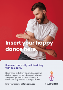
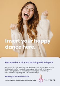
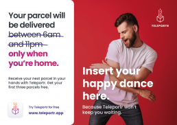
Insert your happy dance here
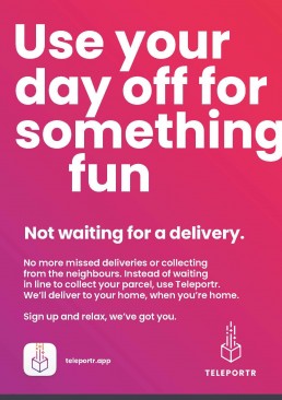
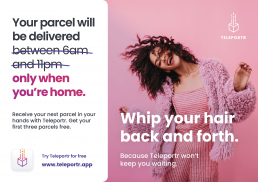
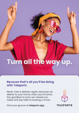
To bring together an integrated marketing campaign, I developed the Happy Dance campaign. Using emotion to create an engaging set of creatives, the Happy Dance aimed to bring humour to showcase the problem that Teleportr was setting out to solve.
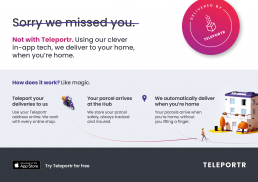
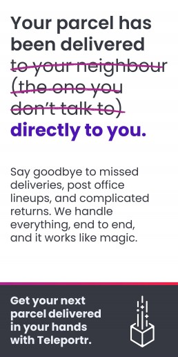
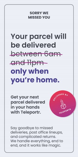
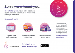
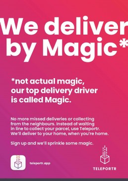
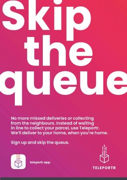
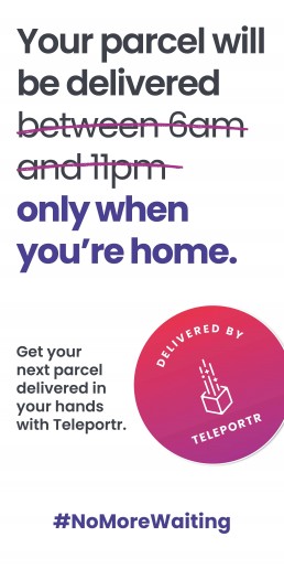
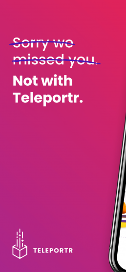
For print and online material, I developed a range of different concepts, based on different themes. Each one used a statement that the customer could relate to and then provided context that the value proposition aimed to solve. Initial feedback was positive in that some of the concepts looked like missed delivery notes so caught the attention early on, as well as explaining the product in a succinct way.
User-focused design
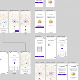
Developing each app screen involved laying out each process that the user would interact with, carefully understanding what is likely to be achieved in that instance, and then elegantly designing a solution. It was important to develop a well-thought out design system that takes context into account, and provide a seamless experience when using the app.
I undertook deep levels of research and testing when exploring methodologies and incorporating human interface design principles. As well as building the UI from the ground up, I improved the current systems creating a more cohesive user flow.
We experimented with different frameworks including the use of Lottie to implement clean animated icons and designs, elevating the in-app experience especially when on-boarding. Working closely with engineering helped solve some of the issues of bounce and drop off rates.
Marketing on the App Store
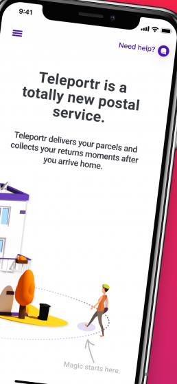
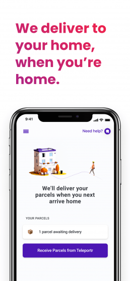
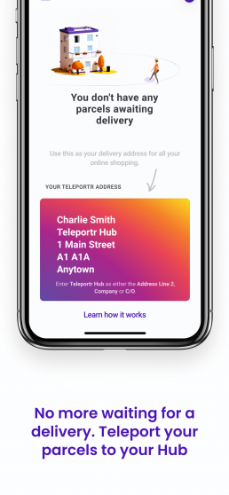
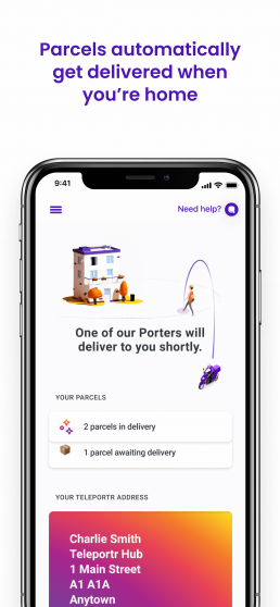
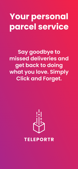
Designing for the App Store gave us another channel to showcase the breadth of the product and design flow. Maintaining our core design standards, I developed a series of creative visuals to present the app in an engaging way. Breaking down the product into a few simple steps was important to focus on how the app solves the users problems.
Inclusive design
Inclusive design
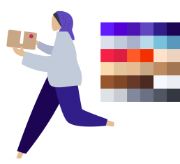
Whilst developing the branding for Teleportr, I realised that illustrations would be vital to build the brand story. They can represent a brand image well and are versatile enough to be quickly adaptable to any scenario. When creating a library I wanted to make sure the brands design was inclusive and diverse.
Building on the Humaaans illustration library I created a range of illustrations as part of the brand design system. These were built modular so elements could be easily changed and modified. The colour library needed to compliment the brand style as well as provide inclusive shades for every day use.
Building a story
Bringing together the elements to show a process adds a layer to the brand which builds on the brand message and story. Creating contained illustrations was important demonstrate the simplicity of the product idea.
Not for diversity's sake
Putting together illustrations and scenes that represented every day life was essential to creating this library. As the product moved to be a part of a users normal day to day activities, it was key to not shy away from the diverse and inclusive nature of society.
Putting it all together
The website redesign project was a large undertaking and it was crucial to not only convey key messaging and communication, but also to simplify the process for users. As well as that, ensuring that marketing metrics can be observed and analysed throughout a customers journey. I designed several layouts and put together a final piece that aimed to guide a user through the product idea, allowed them to buy in to the concept, and gave key call to actions that could be measured and built upon. View the final files in full below.
