
Airtasker
Airtasker is Australia’s largest local services marketplace. It connects people and businesses with members of the local community who can earn money on the side with tasks. The first international market was launched in London.
ClientAirtaskerServicesBranding, Strategy, Digital
Leading and managing all aspects of brand and design development within the UK, I provided strategic input on a variety of campaigns and worked closely with an international cross-functional team.
Campaigns
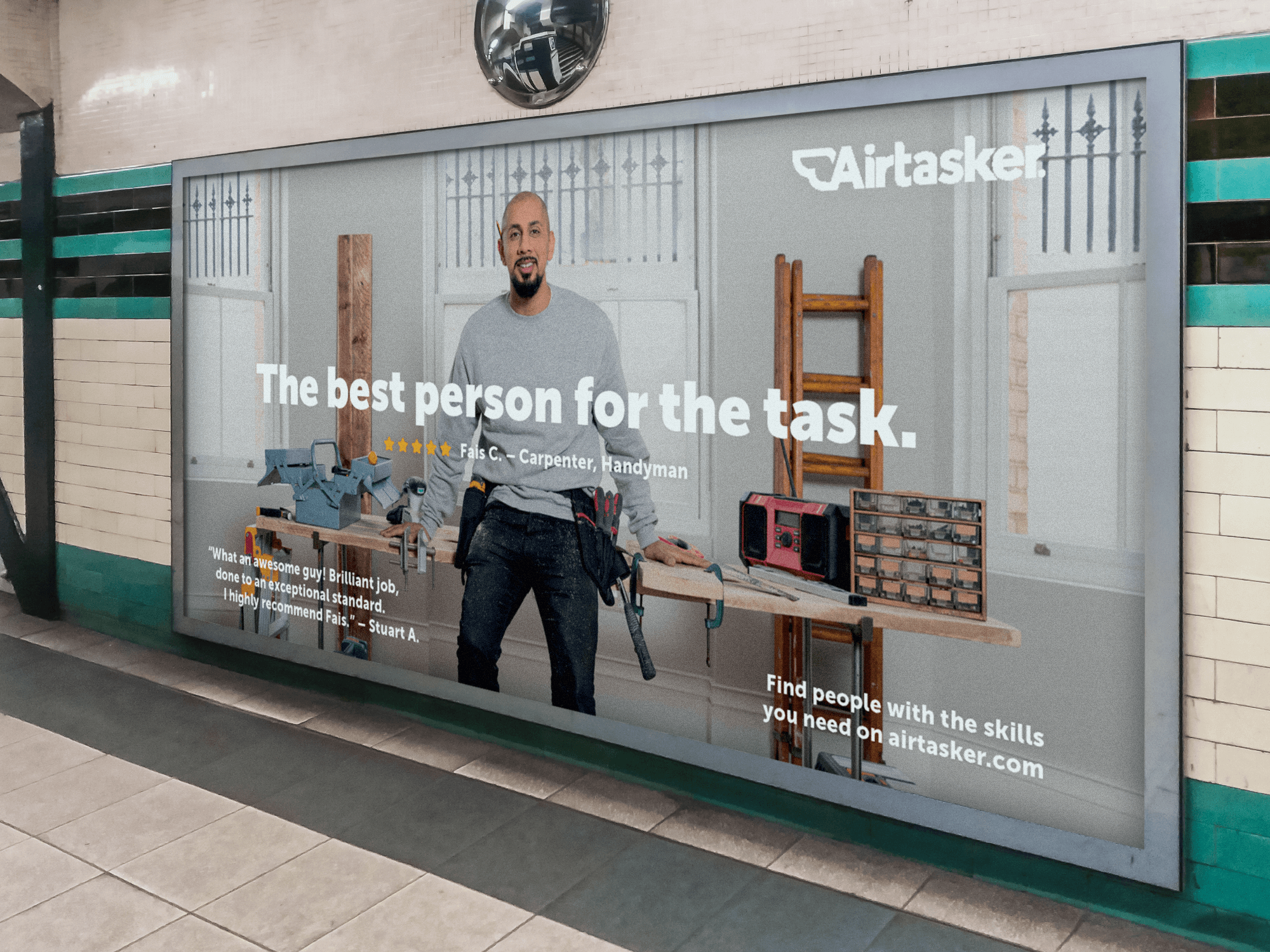
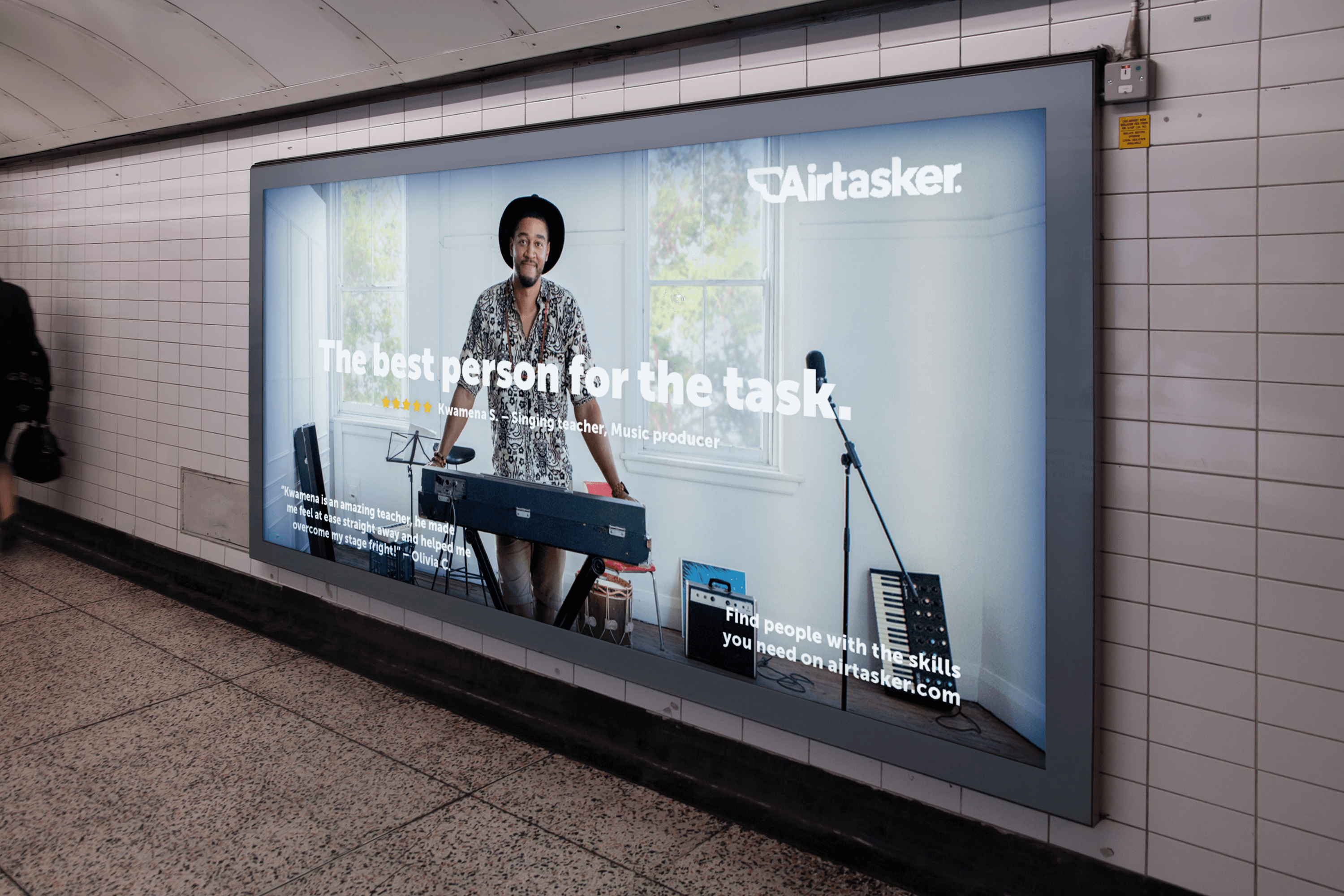
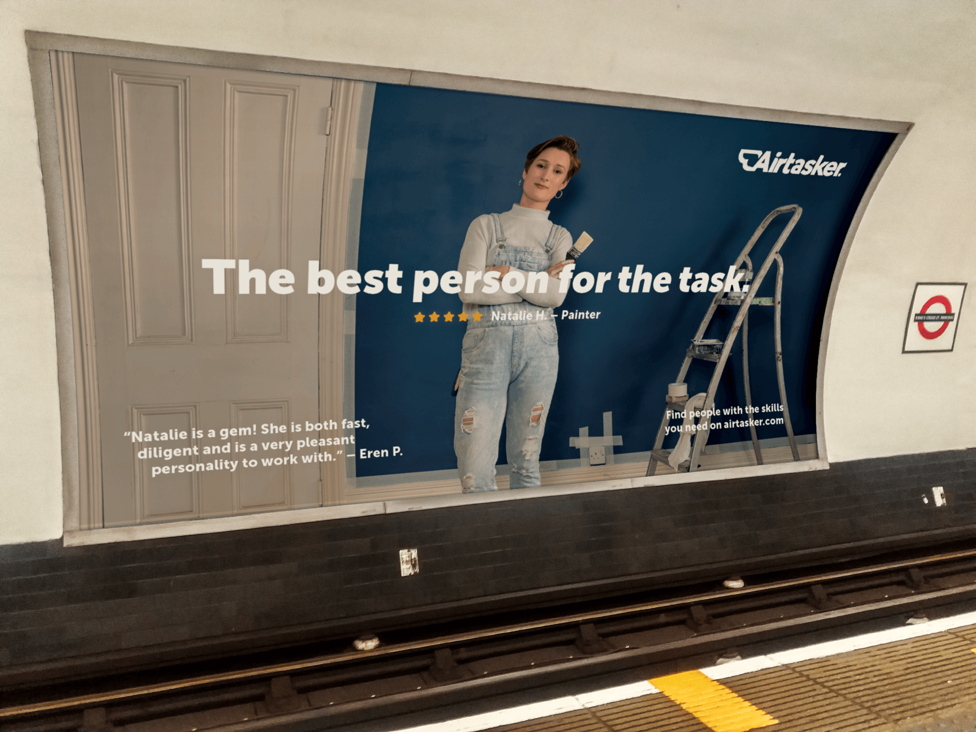

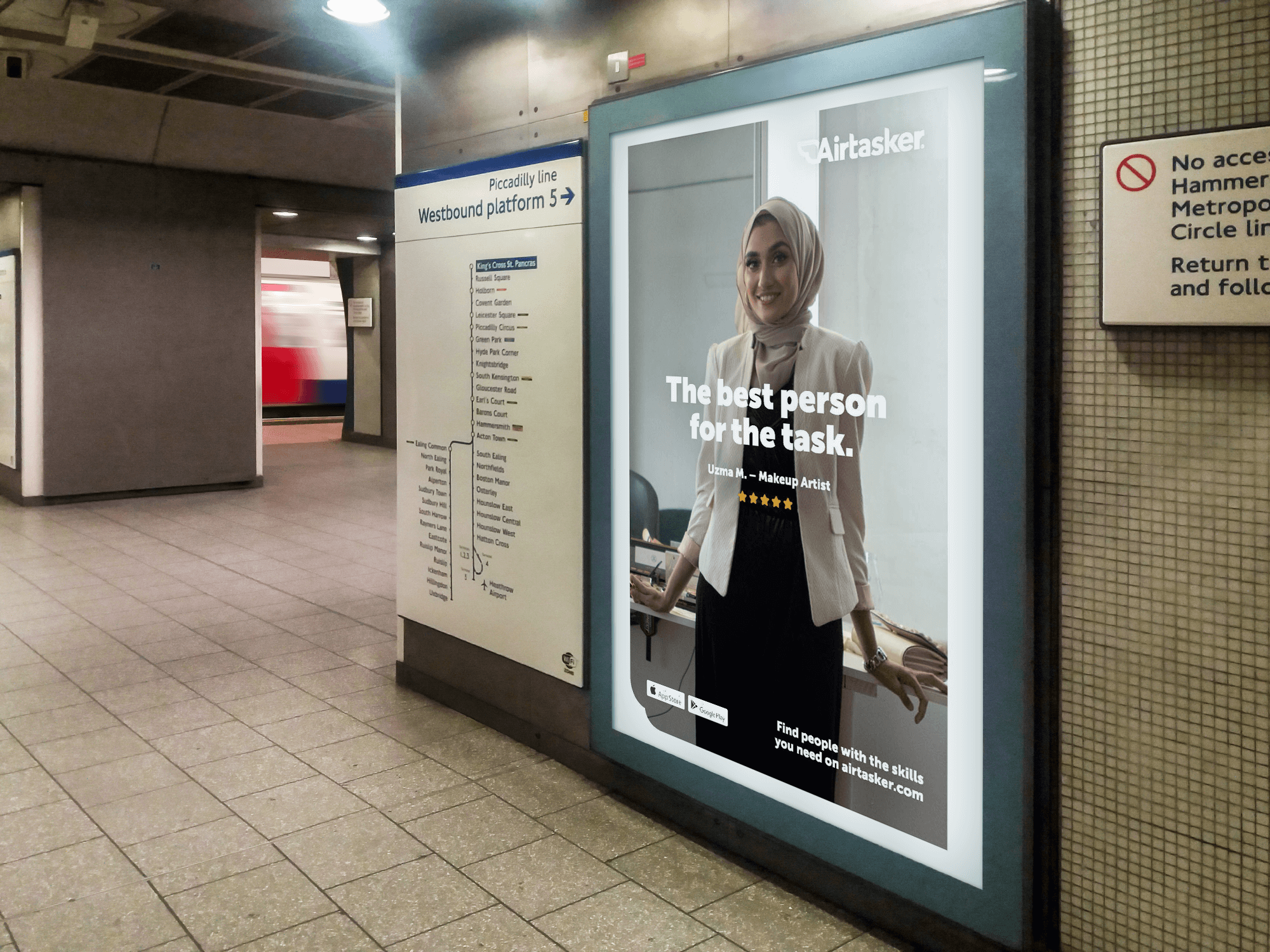
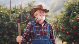
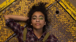
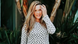
The Best Person for the Task
“We believe everyone should have equal opportunity to earn a fair living from their skills.”
The aim of this campaign was to deliver Airtasker’s core brand message. Bias within society has become commonplace, and in most cases without intention, yet it still exists. The purpose of these outdoor adverts were to challenge stereotypes and celebrate the community of Taskers that have been thriving in our cities.
Process
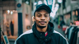
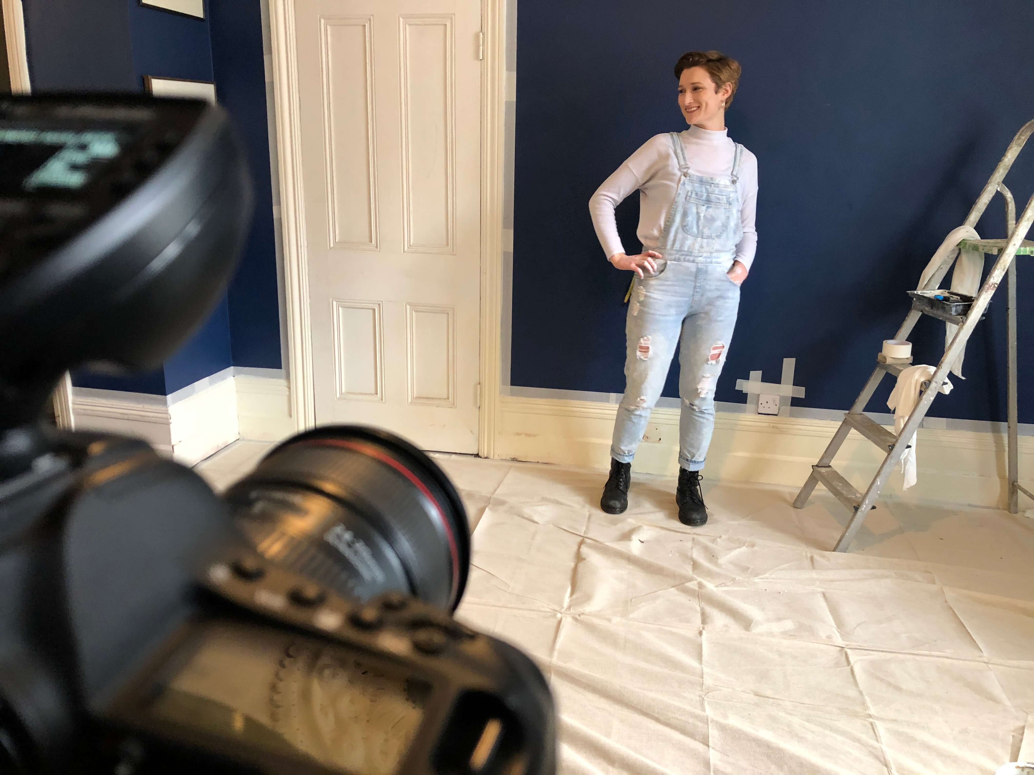
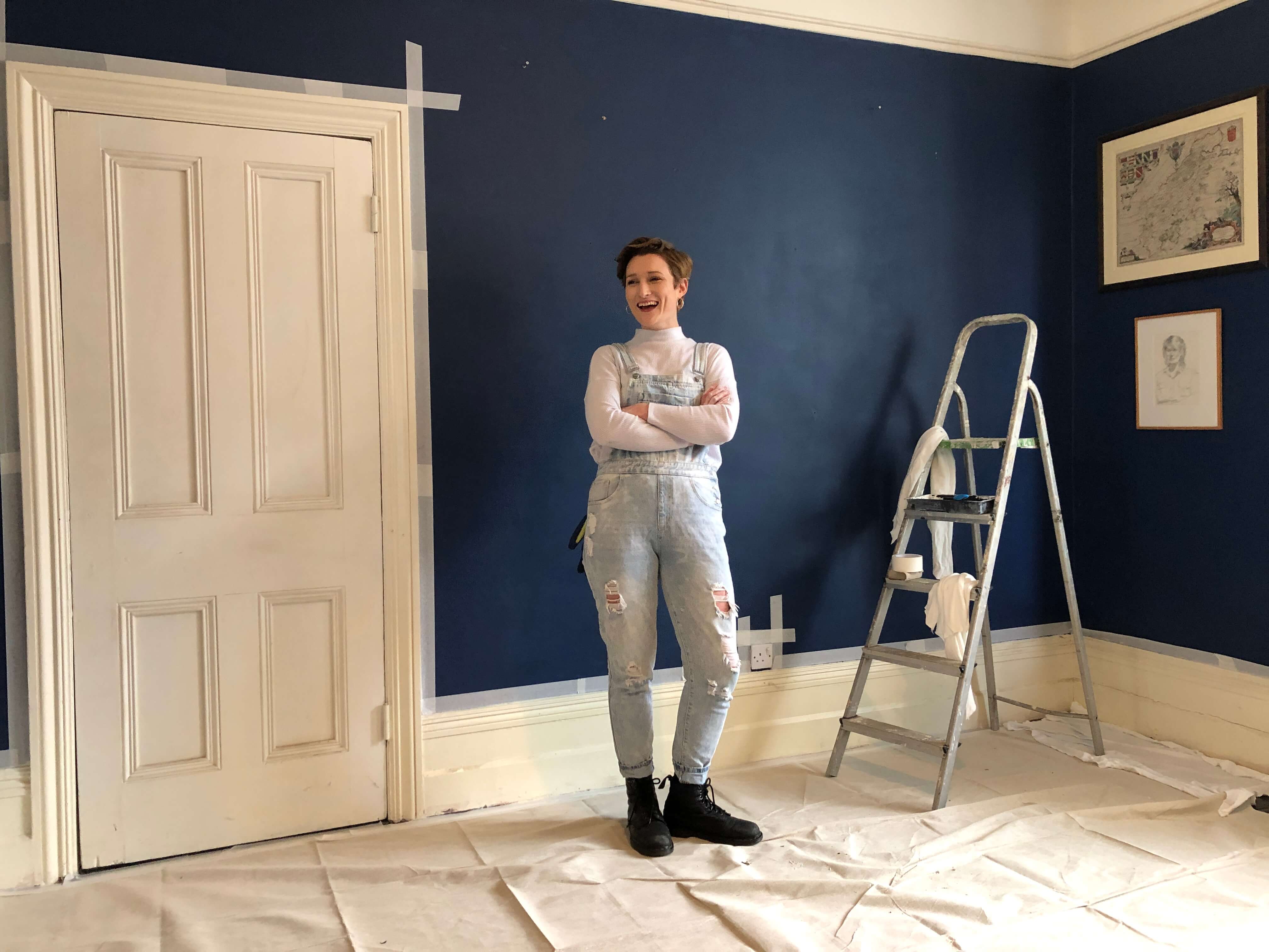
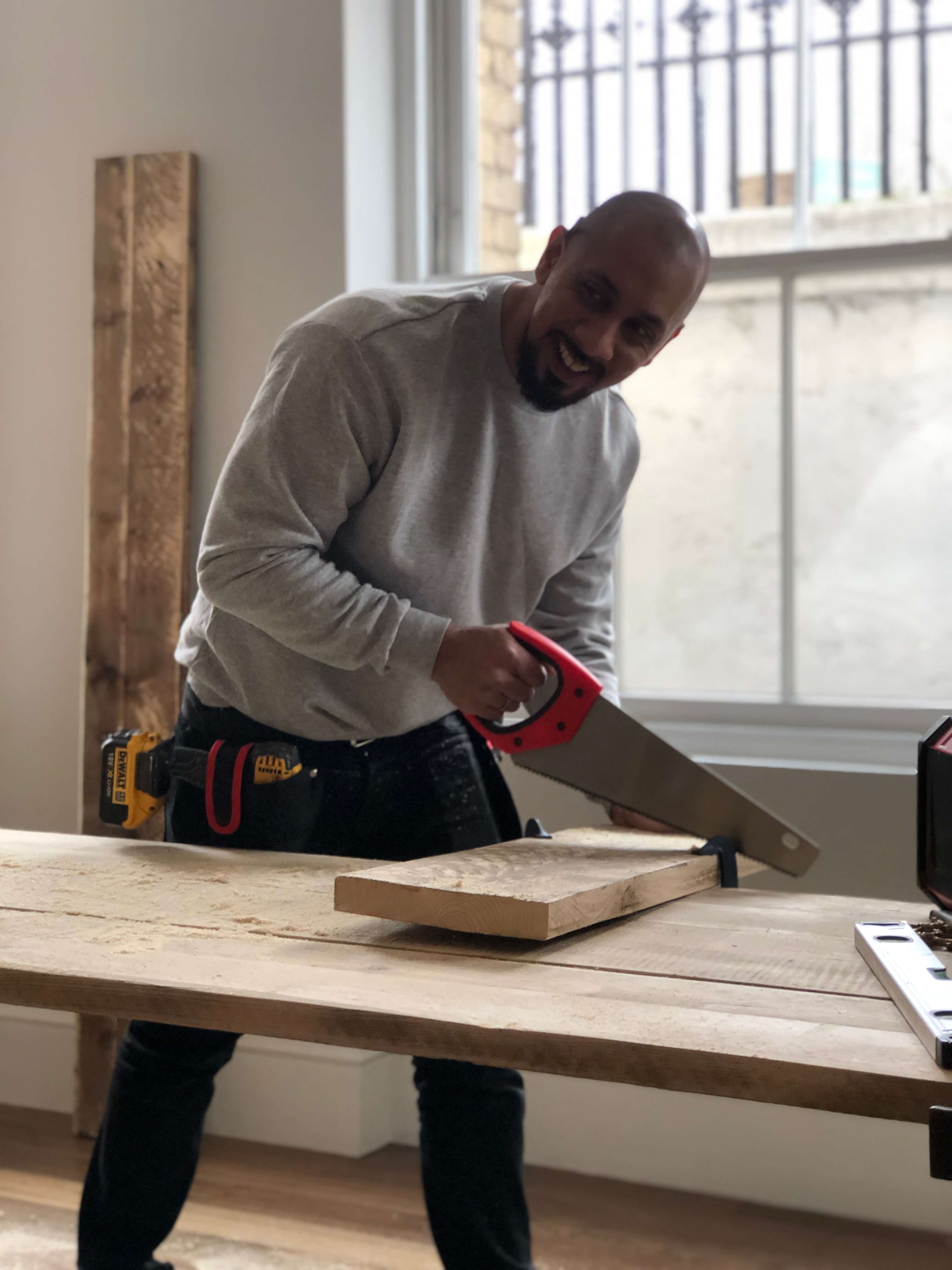
Researching visual styles started the process of developing a theme and style. The campaign’s main objective was to showcase Taskers doing great work and highlight that any individual can use their skills and get the task done. The photographic style chosen represented Taskers in their best light, in their working environment, choosing people that may not be considered a first choice to start with.


Design
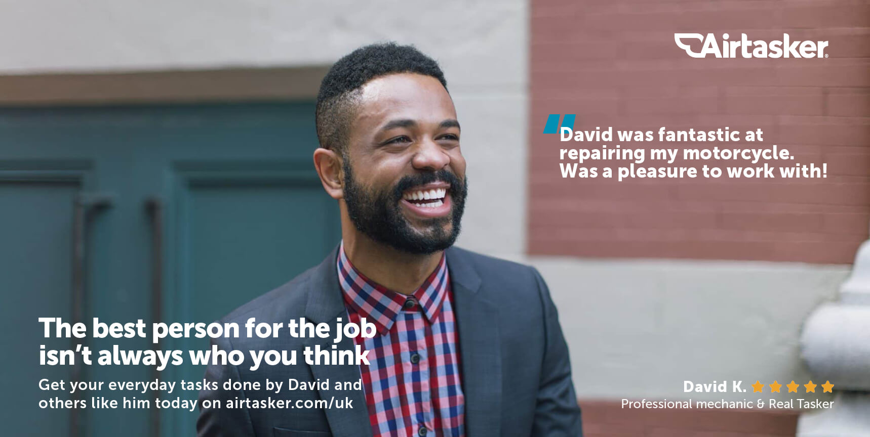
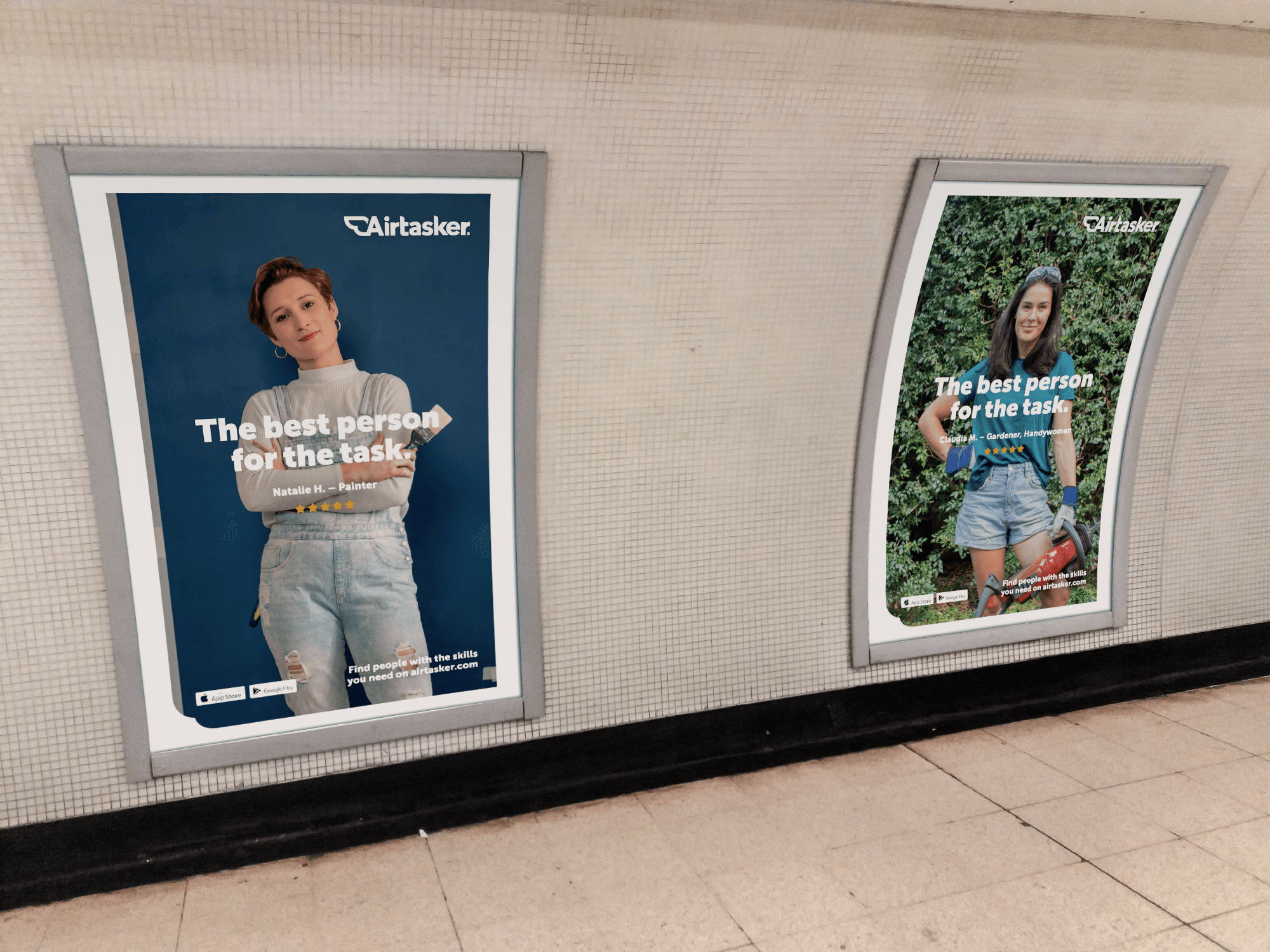
Initial concepts began with full focus on the individual. They were out of context due to their dress and location however once paired with a review not only added social proof but reinforced why they are the best person for the task.
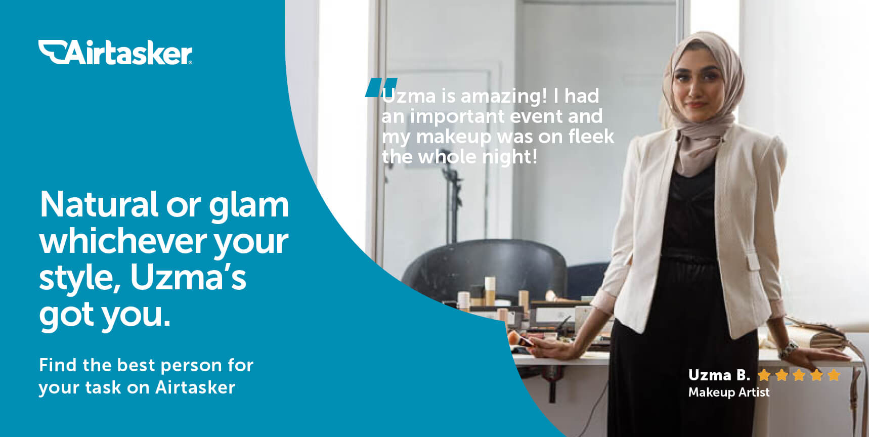
This then developed to include Airtaskers signature blue as a way to identify the brand. It also played with engaging copy that suited the Tasker and their role. The use of the stars meant that the campaign would only use real Taskers from the platform.
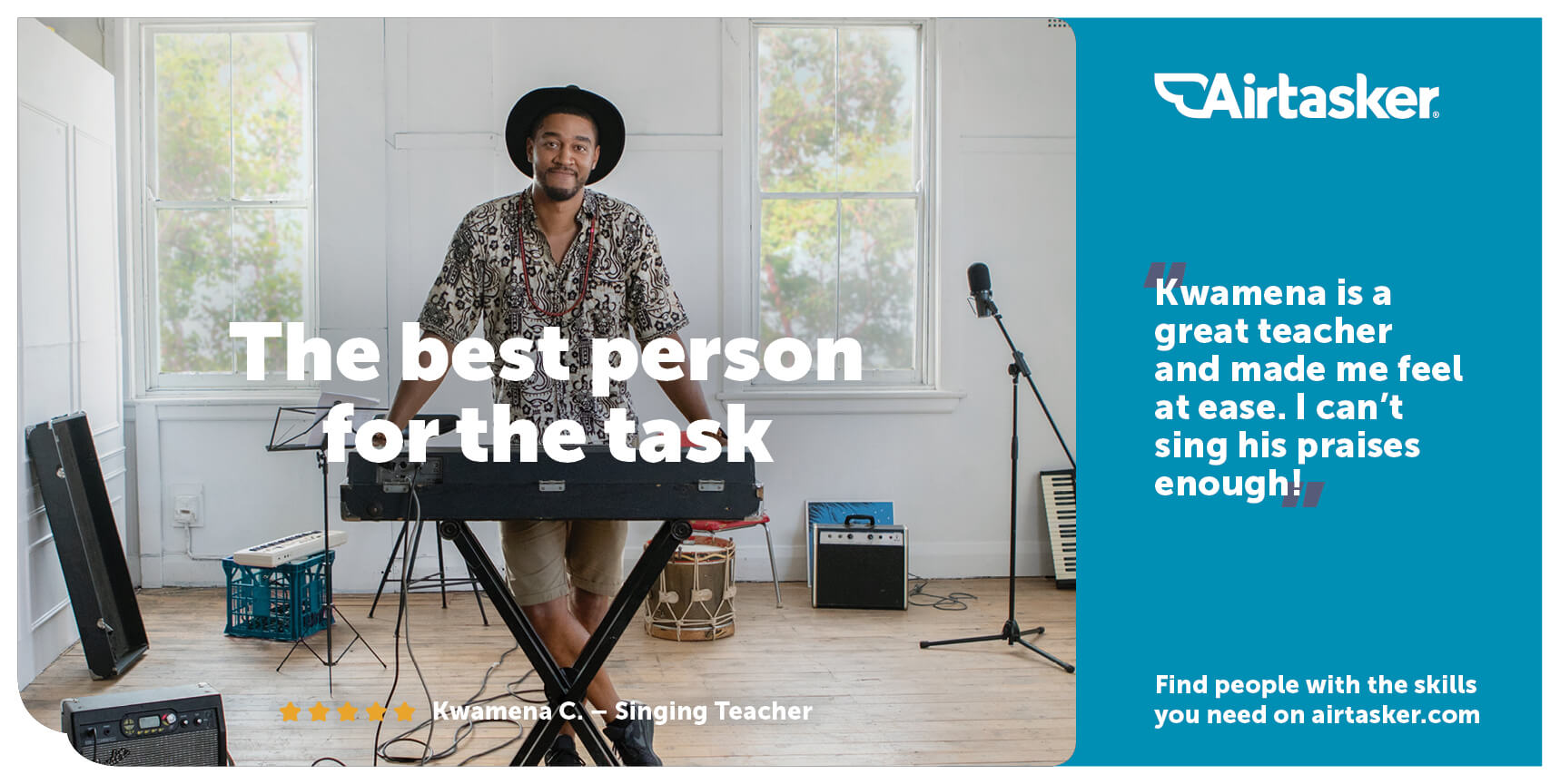
As design developed further, it was important to only use key elements and call to actions, to avoid over-crowding the layout. Using a longer review to add further depth to why the Tasker was the best person for the task was experimented. It also allowed for Airtaskers blue to be used and a brand identifier.
Production

Final delivery
The final execution of the campaign resulted in a clean design layout, with a wider angle to show the Taskers environment and allow space for copy and branding. Whilst art directing the shoot, it was important to show how the Taskers are confident at what they do, representing that they are the best person for the task.